26 Buckets of Paint
Jan 14, 2023
I’ve always been really curious about colour.
A few years ago, I found out about the concept of “reading” colour. You replace each letter with a coloured square (called a chromacon), leave gaps for spaces, and with enough practice, you can slowly read sentences.
 Went *down a rabbit hole.
I got up to the rate of about 60 words a minute. That’s like taking 36 seconds to read the previous paragraph.
It’s not very good for a reading pace, but it means I was able to quickly recognize not just single letters, but groups of letters. I could read common words, prefixes, and suffixes within the first day. Longer or more obscure words took more time.
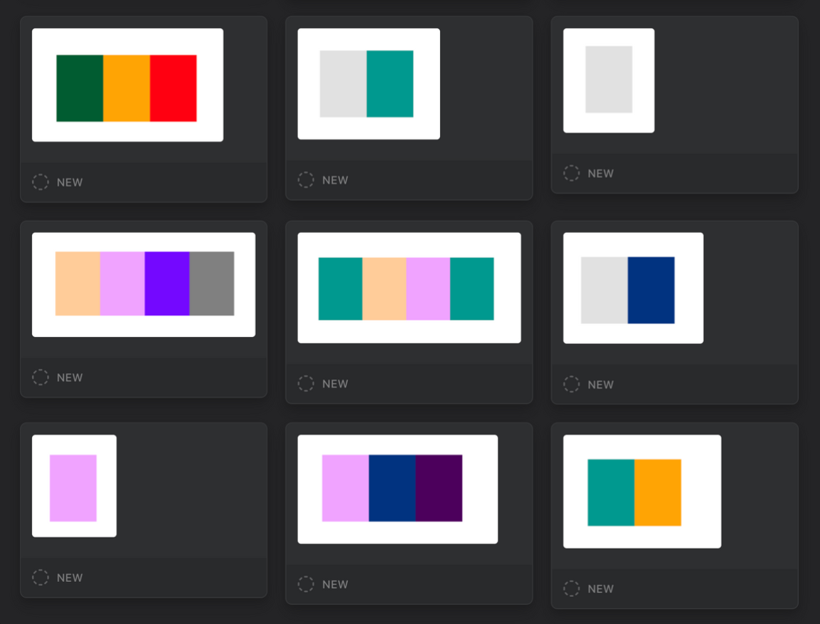 I used mochi.cards to practice the most common English words with spaced repetition.
The words above, starting from the top left, are: for, it, I, have, that, in, a, and, to.
I wouldn’t even say reading colour is a party trick, because it looks pretty weird staring at a bunch of squares and speaking really slowly.
So what else could it be good for?
The cool thing about reading colour is you can make out colours at a much farther distance than you can symbols.
I often think about this in the morning when I’ve left my glasses next to the sink in the bathroom. If there’s a brightly coloured t-shirt across the room on the couch, I’m able to walk over and toss that into the laundry bin before I go to put in my contacts. To put this in context, my vision is -7 (-8 is “legally blind”). If the shirt were the same colour as the couch, there’s no way I would see it.
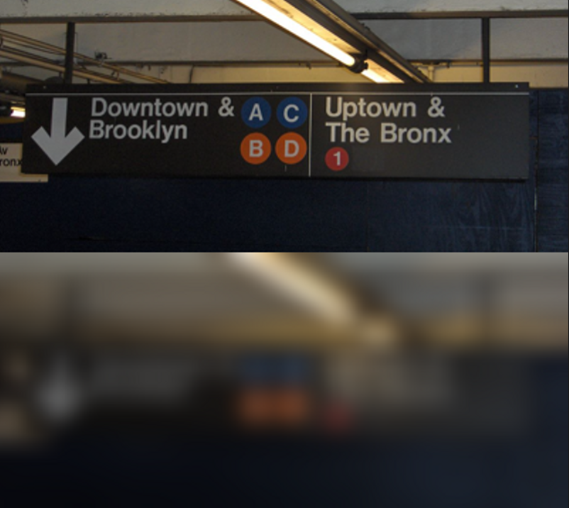 Top: A subway sign if you have good vision. Bottom: The same sign if you have very bad vision, or are very far away.
You may still be able to make out the subway colours at a distance, but not the letters. If I didn’t have my contacts in, this subway sign would look a lot like the bottom image.
Being readable at a distance is one of the many reasons colour-coding is so important in transportation, like train and subway lines.
The NYC subway uses colours to group trains in the same subway line. The colours aren’t used as an alphabet- they’re just for categorization.
What if the subway used colours in place of letters?
Imagine you’re running late for the 1 train, and from across the Times Square station, you see where to go to catch the downtown train.
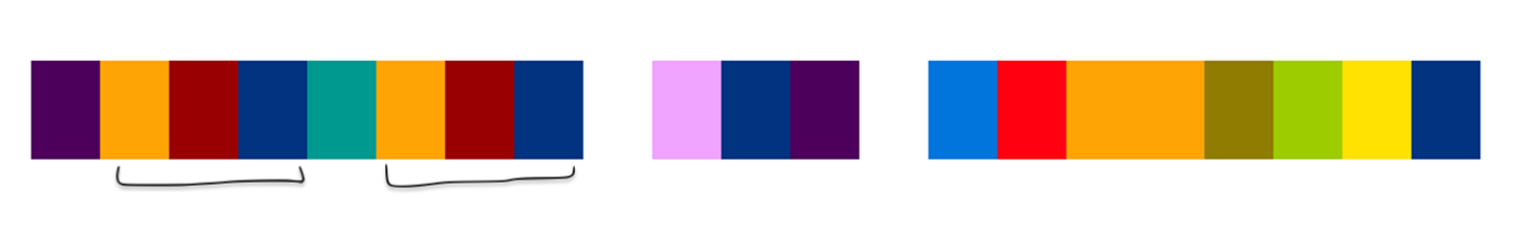 'Downtown and Brooklyn' in chromacons. Notice how letters 1-3 and 6-9 are the same pattern? That orange-wine-navy pattern is 'own'. You’re already reading colour!
This is Downtown and Brooklyn in chromacons. Interesting, but not better than what we already have.
There are a few downsides to using chromacons like this.
Most notably, colour blind people (~4% of the population!) wouldn’t be able to or would have difficulty reading chromacons.
There would also be switching costs with the new alphabet. People would have to learn a new alphabet, or we’d have to add letter symbols over the colours.
Creating these chromacons would be a big challenge. Imagine carrying around 26 little buckets of paint when you want to change a sign. And we haven’t even gotten into punctuation and special characters.
So do I think we’ll be seeing chromacon alphabets in the future?
Yes, but not for transportation.
In physical space, our tools to change the colour of our surroundings are very manual.
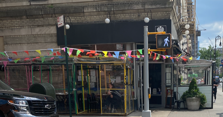 Some flags I took a picture of on a walk. It would be a little tedious to change the colours of these flags.
But in virtual environments? Changing the colour of something takes no time at all.
I think we could see something resembling chromacons in virtual space. Creating a sign with chromacons would take milliseconds, not hours. Maybe each viewer could even customize the way they see colours, or use their own colour-to-letter mapping.
Imagine you have your VR headset on and you’re walking down the sidewalk in a virtual city. You'll see a lot of text and images- letters and logos that you recognize. And in the distance, you see a small 8-colour pattern that you just recently started to recognize, Downtown.
Notes and open questions
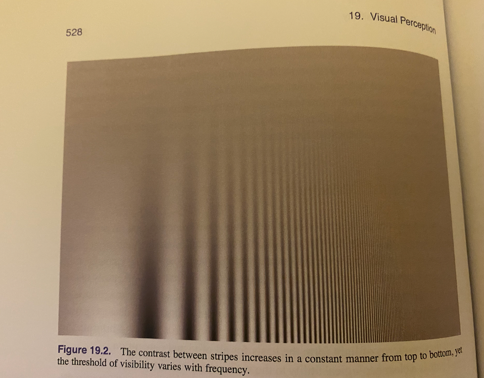
Some background: visual acuity is often measured in cycles per degree. Imagine black and white bars alternating. At what frequency can they alternate at before you can’t see the bars distinctly anymore? For humans, it’s commonly 60 cycles per degree in the visual field.
 This is from Fundamentals of Computer Graphics by Steve Marschner and Peter Shirley.
The question that’s on my mind isn’t if chromacons should completely replace our current alphabet language, but rather if they would be useful for some people and/or in certain contexts. For example, for people with low visual acuity, if they could toggle a mode in their video game to use chromacons instead of letters, would that be helpful?
Blending is a potential drawback of using chromacons at small sizes or long distances. I wonder how this would affect pattern recognition.
Fatigue and headaches could be a risk with reading chromacons. There are physical changes with rods and cones that happen in our eyes when we’re looking for a certain colour. This effect may be more pronounced with highly saturated colours because the eye has to focus on different wavelengths. Will identifying many colours in a short timeframe hurt or strain our eyes?
I don’t have a good solution for how punctuation and special characters would be done with chromacons. As you grow the alphabet, it’s inevitable that there will be colours that look similar. By mixing colours from scratch in my paintings, I’ve improved my ability to distinguish colours, so can this be overcome to some degree with practice? Is practicing worth it if it’s a small improvement?
You don’t have to learn the full chromacon alphabet or be able to read colour fluently to get use of out chromacons. If you’re managing a brand, you can use the chromacon version of your brand name in marketing materials. Your audience might start to recognize it, and they might recognize chromacon patterns somewhere else as well.
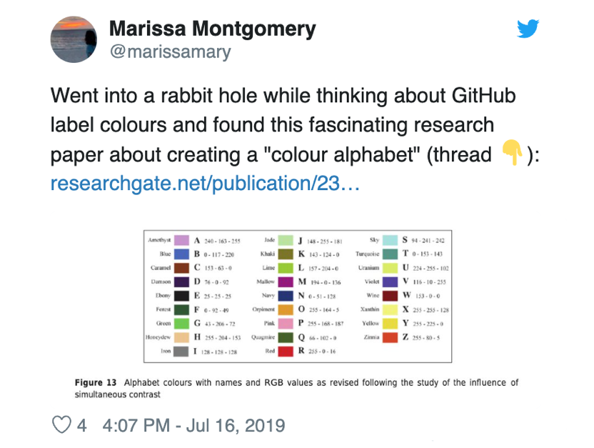
This is the tweet from 2019 when I discovered chromacons, and this is the paper that inspired it.
This is the letter-to-colour mapping that I use: marissamarym/chromaconator-js.